McGrath Architects
- Brand Strategy
- Visual Identity
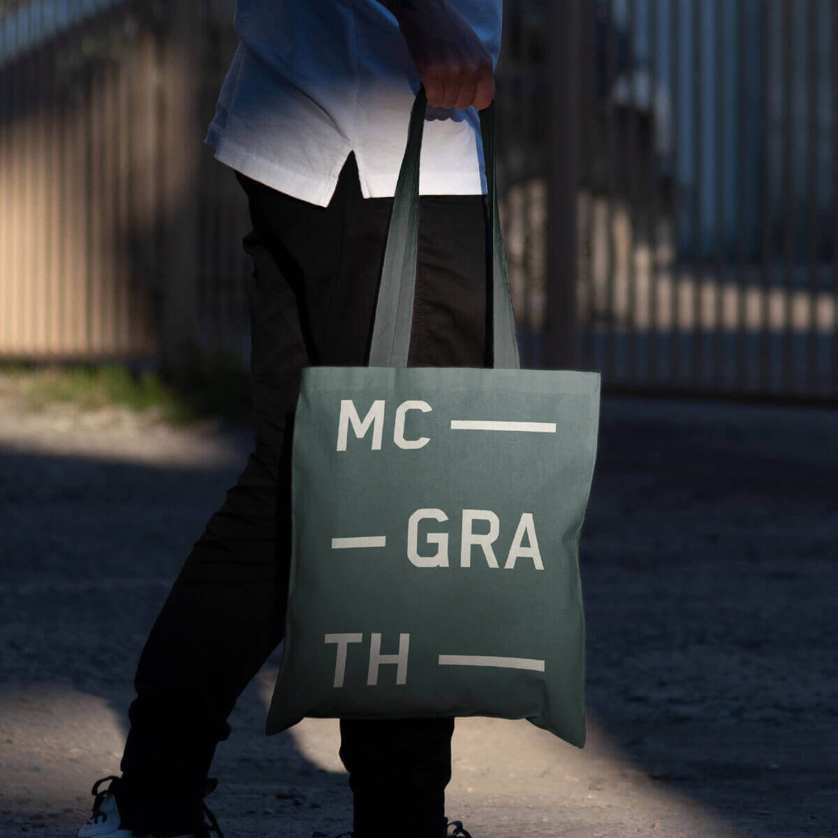
- signage
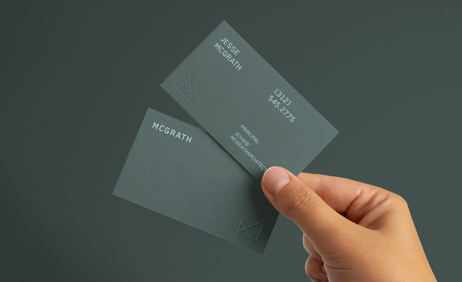
McGrath Architects is an independent business offering solutions for both real-estate and architecture. Their goal: make the process of finding a property and transforming it into a space you love simple. Together we worked to develop a new visual identity for the firm that conveyed the functional, technical, and aesthetic considerations they promise for their clients. The firm’s requirements for print collateral were simply this: "No Nonsense."
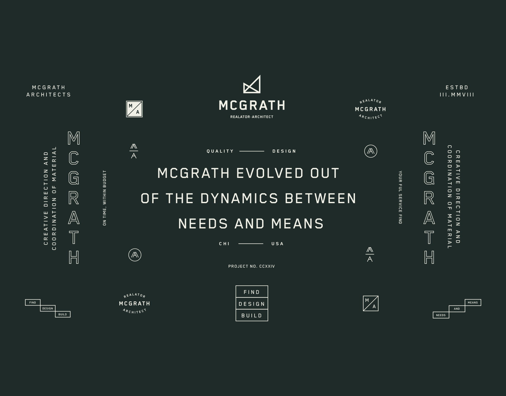
The Logo
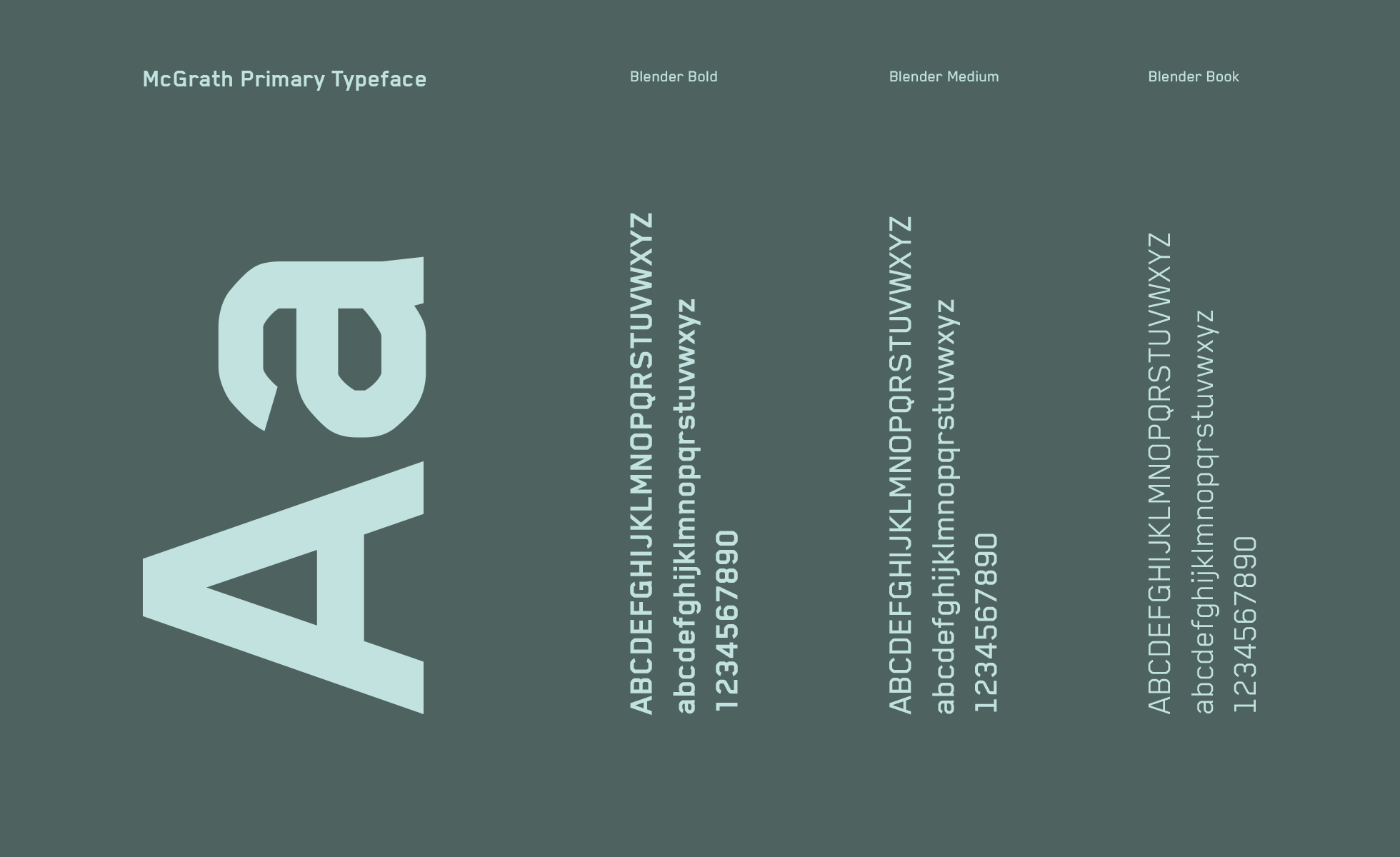
Inspired by the tools used in drafting early architecture projects with pen and paper, the triangle rulers were the perfect foundation for the logomark. The 45/45/90 and 30/60/90 lines are paired with a solid wordmark set in Blender by Binneland, inspired by an early CAD typeface and chosen based on its technical yet approachable feel.
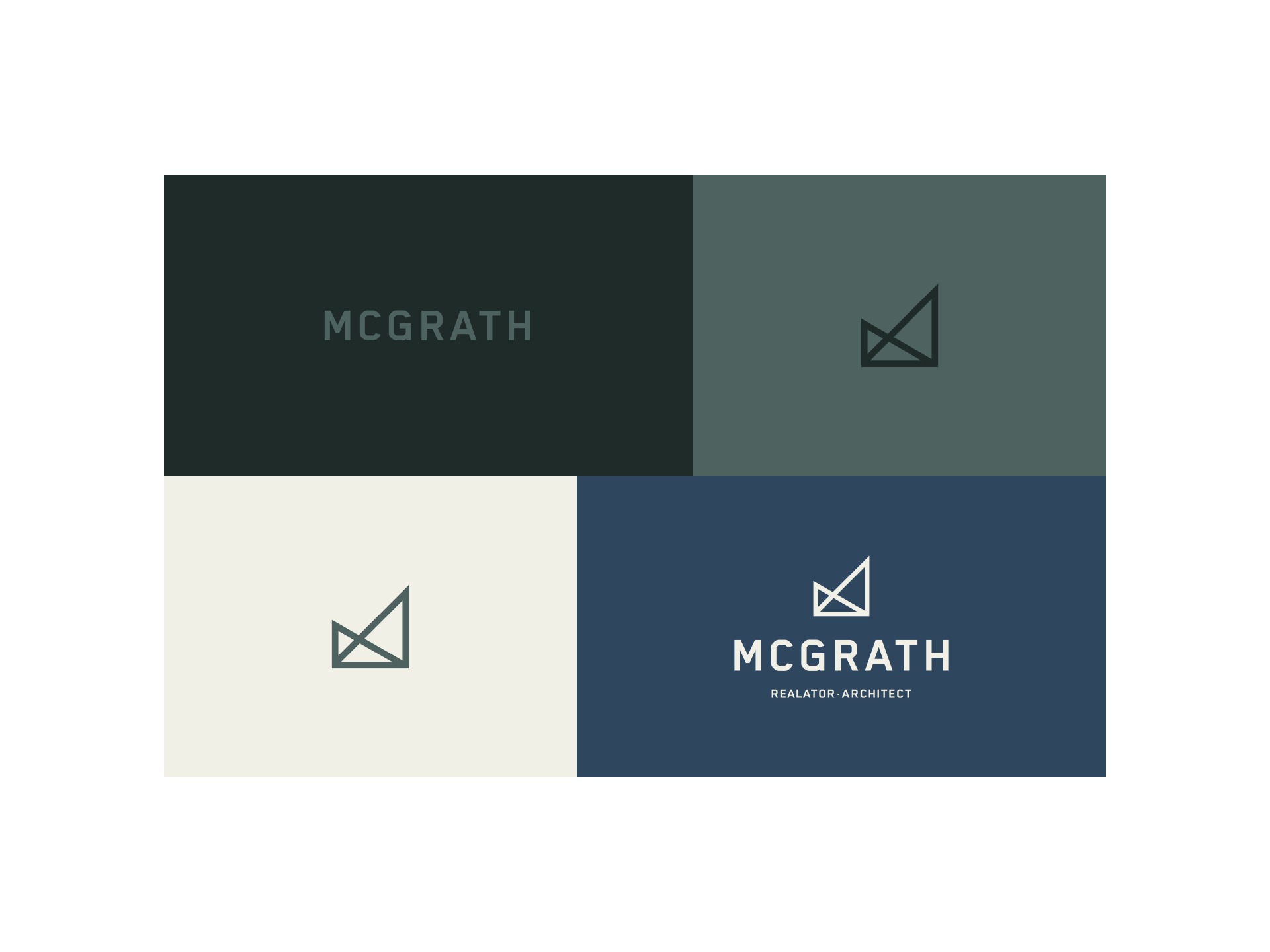
An Inspired Palette
A clean, bold, and elegant palette was derived from two essential trade tools: architecture's (cutting board green) and real-estate’s (painters tape blue).